 Those who know me well, are resigned to my evangelical conversion to the e-reader. The convenience, accessibility of books and light-weight nature of the e-reader had me at “e”. But that being the case, I still appreciate the beauty of the physical book, which my cherished library can attest to.
Perhaps what I miss most with e-books are the book covers; well, I miss some covers. There have certainly been times when the cover of a book—even a beloved novel—has been so…wrong, it’s quite off-putting. I don’t know I have any in my collection quite this disturbing, but here’s a couple from an article on ‘Flavorwire’ highlighting twenty of the worst covers for classical books. They’re so appallingly inappropriate you can only laugh ’til you cry.
 The physical book, and covers in particular, can be problematic when “selling” a book to a child or teen. Many books—particularly classics that had a dated look—were summarily rejected on that basis by my son, even though he loved to read. A musty or peculiar smell was another factor for rejection. Sometimes I was lucky enough to find an alternative edition of the book and present it at a later date, but usually once the judgement had been made—well, that was it. E-books circumvent this issue, as the cover art is rarely a consideration.
And that’s also the e-book shortfall when it comes to younger readers. The cover art is often that—art—and an engaging image, often a collation of story elements, imbeds itself in the memory along with the enjoyment of a novel. Over recent years, I’ve given a great deal of thought to the pros and cons of the e-reader verses the physical book from the perspective of children and young adults, a topic I’ll explore another time as it’s something of a digression from the topic of book covers.
Designing Book Covers
 While the laughably inappropriate covers above are certainly poor examples of cover art, there are some beautiful and fanciful covers now decorating bookstore shelves. When creating a design that’s engaging and attractive for the young adult market, a raft of considerations come into play. This interview with Tom Forget in the article, ‘The Secret Lives of YA Cover Designers’ provides some interesting insights.
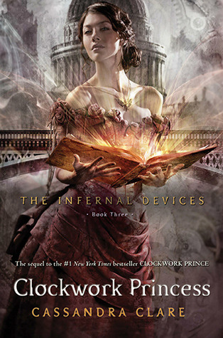
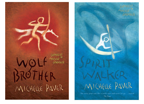
When discussing this topic recently, Cereal Readers’ Kara Smith nominated the book, ‘Clockwork Princess’ from the Infernal Devices series by Cassandra Clare as one of her recent favourites, while I find the ethereal covers for the Chronicles of Ancient Darkness series by Michelle Paver, both primitive and strangely moving.
Vintage book covers have their own unique appeal, often bundling our childhood memories into their bright illustrations—slipping us back in time as easily as those glossy jackets slide off the treasured hardbacks. A fond exploration of the tactile nature of vintage books and covers was recently the topic of a PaperPi blog. PaperPi pays homage to all things paper, highlighting its remarkable beauty and versatility.
Book covers. What started as a simple musing has become a delta of topics, too multifaceted to explore in just one post. For my colleague, Kara, book covers are a special subject indeed, and now she’s opened my eyes: there’s a lot more to talk about! So, expect to see another blog or two on book covers in the not-too-distant future. If you have a particular cover—old or new—that says something special to you, please comment.
Marielle Rebbechi


